The Popular Music over the last 55 years
24 May 2016The code of this project can be found on my GitHub account.
Whether one likes it or not, music is an art that does not let people indifferent. With the development of various technologies like the radio, the TV and most recently the Internet, it gets easier and easier for most people to listen to music. It is now possible to choose the songs you like in a huge catalog of musical styles, bands and singers coming from all over the world.
Even if the musical diversity is amazing today and if everyone's taste differs, it cannot be denied that some artists, bands and songs have marked the last 50 to 60 years of music history.
Rankings like the Billboard Hot 100 try to classify and rank the popularity and success of songs and artists over time. This chart, created in 1958, is the music industry standard in the United States for singles. Chart rankings are based on radio play, on-line streaming, and sales (physical and digital). As the US are very influent regarding music tastes, the Billboard Hot 100 can be used as a good estimation of the worldwide music trends.
Billboard also provides year-end charts running from the first week of December to the final week in November. These rankings give an interesting overview of what happened during the year, who are the most dominant artists, which are the most remarkable songs of the year and so on. Therefore, by combining the year-end rankings it seems possible to analyze musical trends year by year, decade by decade and even on larger periods.
Using this data as starting point, my objective in the following article is to try to find some interesting patterns in the popular music of the last half-century, song or artist related, and to discover and let other people discover new tracks and singers.
Data Wrangling and Dataset Visualizations
Wikipedia brings together all the Billboard year-end charts. An example can be found here: Billboard Year-End 2015. Using the Python library Beautiful Soup, I have extracted all this data into separate CSV files (on per year). Then these files have been merged in a Pandas dataframe to let me manipulate, aggregate and transform the data.
# of tracks by artist VS # of years of presence in the Billboard Hot 100
Firstly, I was very interested in trying to identify what are the artists or bands who have the highest number of songs ranked in the Billboard Hot 100. Some choices have been made in the way to count the number of tracks for each artist:
-
If a song is a featuring, the same significance has been given to each artist contribution.
E.g. Ne-Yo featuring Juicy J - She Knows will give one song for Ne-Yo and one for Juicy J. -
If the artist name includes an '&', it is assumed that it is a band or an indivisible duo / trio...
E.g. Kool & the Gang - Celebration will give one song for Kool & the Gang. -
If the artist name includes an 'and', I have handled two separate cases:
-
If the song has been released before 1982, the artist has been considered as a band, as it seems very frequent to have band names like Derek and the Dominos in those years.
E.g. Derek and the Dominos - Layla will give one song for Derek and the Dominos. -
If the song has been released in 1982 and after, the same significance has been given to each artist contribution.
E.g. R. Kelly and Celine Dion - I'm Your Angel will give one song for R. Kelly and one for Celine Dion.
-
If the song has been released before 1982, the artist has been considered as a band, as it seems very frequent to have band names like Derek and the Dominos in those years.
-
Some exceptions have been handled manually.
E.g. Evan and Jaron - Crazy for This Girl (released in 2001) will give one song for Evan and Jaron.
This methodology is not perfect, but it seems reasonable and accurate enough for the study. The choice of 1982 has been done by looking into the data and investigating manually on the band names.
Taken alone the number of tracks ranked in the Billboard Hot 100 year-end is interesting but as these figures are not time related, it is difficult to really compare the top performers and to try to identify some potential raising stars / long term performers. That is why I have decided to combine that value with another feature which is the number of years of presence in the charts. Therefore, it will be possible to be concerned about the success of an artist but also about his longevity. Indeed, flooding the charts with a lot of songs during less than five years does not send the same message as being present in the Billboard ranking with one song every year for more than a decade.
To represent this information, I have chosen to use an interactive scatter plot showing the number of tracks in the Billboard Hot 100 year-end on the x-axis and the number of years of presence in that chart on the y-axis. In addition, this scatter plot has some custom features:
- When you hover over a circle, it gets bigger and a tooltip displays the name of the artist and his number of songs in the top and his number of years of presence in the Billboard Hot 100.
-
When a circle has a red outline, it means that two (or more) artists have the same characteristics i.e. same number of songs and same number of years of presence in the Billboard Hot 100 (year end).
Jittering has been used to display the different circles when they have the same coordinates. - You can click on an artist's circle to have more details about this singer or band. A table will show up below the graph with the name, release year and rank of all the tracks ranked in the Billboard Hot 100 for this particular artist. You can also play a preview of the track (30 seconds). To be able to preview the track, I have used the Spotify Web API.
- Using the buttons on the top right corner of the graph you can choose how many artists you want to display on the graph.
| Song Title | Year | Rank | Track Preview |
|---|
Visually we can observe a trend. It seems that the more years you spend in the charts, the more ranked tracks you have. This is quite logical. By displaying the 100 most represented artists in the Billboard Hot 100, we can also notice a kind of boundary located around 17 tracks ranked in the charts. Indeed, approximately 70 artists among the top 100 have 17 and less tracks ranked and only around 30 have more than 17 tracks in the Billboard charts.
To try to formalize this trend and identify which relation exists between the number of tracks and the number of years of presence in the charts, I have used a linear regression on the top 100 artists. You can display the regression line by checking the checkbox located on top left corner of the plot. The parameters of the linear regression have been estimated using scikit-learn. Here is the equation of the best linear fit that I have obtained: $$ \text{# of years of presence in Billboard Hot 100} = 3.32566998 + 0.31592062 \times \text{# of tracks in Billboard Hot 100} $$
This line helps us to identify different categories of artists:
- The high-longevity artists
- The well-established artists
- The very productive artists or hit-machines
- The raising stars and high-potential artists
The high-longevity artists are artists and bands located above the regression line. The higher above the line they are, the longer is their career. Some monuments of music history land in this category. This is for example the case of Madonna, Mariah Carey, Elton John, Stevie Wonder, The Rolling Stones... These artists have managed to cross the ages, remain successful and productive. They can be taken as career examples for young generations of singers.
The well-established artists category is made by singers and bands located around the regression line. This is where we find the highest number of artists. For instance we can quote Usher, Whitney Houston, Justin Timberlake, Alicia Keys, Britney Spears, George Michael or Marvin Gaye. These singers release or have released successful disks regularly for significant amount time. Not all the songs of their albums are big hits and they don't always produce a new disk every year but they have an important spot on the World musical scene.
The very productive artists or hit-machines category corresponds to the bottom right corner of the chart. This area is characterized by artists or bands having managed to have a very high number of tracks ranked in the Billboard Hot 100 in only a few years. This is the case of Rihanna, The Beatles, Drake, Ludacris, Lil Wayne and Chris Brown. Artists like Rihanna and Drake are part of the most popular singers right now and their career is not showing any signs of stopping. To maximize their success, they even have released a new song together at the beginning of 2016 (Rihanna - Work ft. Drake) which will probably be on the Billboard Hot 100 at the end of the year. On the other hand, The Beatles have separated a long time ago but during their short 10 years career (and only 8 years recording career) they produced a huge number of hits and became one of the most popular band of the music history. Theoretically, according to the regression model, in 8 years of career you should have 15 tracks ranked in the Billboard charts. The Beatles overshot this figure and have ranked 26 songs!
The raising stars and high-potential artists are the artists who have been successful for only a short period of time (seven years and less) and who have rank many tracks in the charts. This category is mainly located on the bottom left corner of the visualization. Artists like Bruno Mars, Nicki Minaj and Katy Perry can be considered as raising stars as they are becoming more and more popular and as they have been well represented in the Billboard rankings of the last three to five years. Lady Gaga, 50 Cent, The Notorious B.I.G and The Black Eyed Peas cannot be classified in the previous category but they can be grouped together in the high-potential artists bucket. For different reasons, those artists did not manage or choose to have a long career. Indeed, The Notorious B.I.G was murdered when he was at the top of his career. The Black Eyed Peas members decided to put the band aside to lead solo careers while the band was one of the world's best selling group of all time. 50 Cent and Lady Gaga, after being two of the most productive and successful artists in the world for five years, have become more discrete but they still have a high hit-potential if they want to come back.
This simple analysis and regression has enabled us to have a first idea of who are the popular artists of the last 55 years and how we can categorized them.
Artist Familiarity / 'Hotttnesss' VS Artist Dominance
Knowing who are the most successful, productive and well-established artists of the last half-century is a good thing. But this does not really give us information about how dominant an artist is (was). Indeed, some singers or bands could have been very dominant for a short period of time and not appearing in the previous graph. For example, based on the comments done previously, The Beatles have probably been very dominant during the sixties.
First, let's define how I have chosen to quantify this dominance. For a given period of time we have: $$\text{Artist Dominance} = \frac{\text{# of tracks for a given artist in the given period}}{\text{total # of tracks during this given period}}$$ The number of tracks corresponds to the number of tracks in the Billboard Hot 100 year-end.
To evaluate the dominance of each artist, I have chosen to use rolling periods of three years. I think this is relevant and that it should capture enough information for the study. Once, this information has been collected I have identify what is the most dominant period for each artist.
I was also very interested in combining this information with a measure of the current popularity of the singer or band because I think that being able to last over time and stay popular is also a form of dominance. Plus, I also consider that artists who are very popular right now kind of dominate the current music scene. That is why I though it could interesting features to visualize together.
The Echo Nest API offers an incredible catalog of music data including broad and deep data on millions of artists and songs. In particular, this API enables user to have access to the familiarity and the 'hotttnesss' of a given artist. These two metrics are defined as follows (source: http://4chanmusic.wikia.com/wiki/The_Echo_Nest):
- Familiarity - A numerical estimation of how familiar an artist currently is to the world. 'Familiarity' corresponds to how well known in artist is. You can look at familiarity as the likelihood that any person selected at random will have heard of the artist. Beatles have a familiarity close to 1, while a band like ‘Hot Rod Shopping Cart’ has a familiarity close to zero. It can be described as well-knownness.
- 'Hotttnesss' – This corresponds to how much buzz the artist is getting right now. This is derived from many sources, including mentions on the web, mentions in music blogs, music reviews, play counts, etc.
Using the Python version of the API called
This chart have the same functionalities as the previous one but it also has some additional ones:
- Using the buttons on the top left corner you can choose to visualize either the artist familiarity or the artist 'hotttnesss'.
- The slider at the bottom of the graph is here to let adjust the time period which interests you. Therefore, you can only consider a particular decade. The artists who will be in the filtered dataset are the one who have their period of maximum dominance included in the filtered period.
| Song Title | Year | Rank | Track Preview |
|---|
For the whole period of study, it is quite surprising to see that the most dominant artist is T-Pain, who managed to rank 18 songs in the Billboard Hot 100 between 2006 and 2008 (included). That is very impressive. If we look to these songs a bit closer, we can notice that in addition of a prolific solo career, T-Pain has done several featurings with other really popular artists between 2006 and 2008. For example, we can quote the featuring on "Low" with Flo Rida which reached the first place of the Billboard Hot 100 in 2008.
Following T-Pain, it is less surprising to find Rihanna, The Beatles and Lil Wayne tie with a 5.33% dominance. Drake comes next. Thus, we find the very productive artists or hit-machines that we have identified in the previous section of the article.
Most of the high-longevity artists are ranked in 25 more dominant artists but their dominance is not as important as the dominance of The Beatles for instance. They have been more dominant over time with a constant dominance around 2% for more than 10 years in a row. The perfect illustration of this is Mariah Carey. Her highest dominance value is 3% and she reached this value three times in a row in: 1990-1992, 1992-1994, 1994-1996. Therefore, it is clear that she has largely dominated the beginning of the nineties.
If we look at the 50 most dominant artists, the majority of the other singers or bands classified in this chart stands in either the well-established artists or the raising stars and high-potential artists. This is in agreement with the definition of those categories. If we choose to display the 100 most dominant artists, we start seeing less well-known singers and bands or at least older artists which I think is very interesting. However, on the global period it is difficult to visualize 100 artists. That is why using the cursor to focus on particular periods of time is very useful.
If we isolate each decade, it seems that from 1960 to 2000 there were globally one or two very dominant artists by decade. They are often the symbol of the music of this period. The rest of the songs in the Billboard Hot 100 seems relatively fairly distributed. After 2000, the trend seems to change. Much more artists managed to have dominance greater than 3%. For instance, 21 artists have a dominance greater (or equal) than (to) 3% between 2000 and 2015. The diversity of the singers or bands ranked in the Billboard charts is decreasing as around 25 singers seem to produce the majority of the successful songs. I am tempted to say that this is probably linked to the raise of technology and especially the advent of the Internet. Indeed, it is easier for artists to get visibility all over the world. There is no limitation to one kind of music, everyone gets his chance and thus we don't have one artist dominating outrageously the others. However, as soon as you become powerful and have influence, all this technology, like social media for example, helps you to stay popular and to automatically increase the success of your next song or album. If we consider Rihanna for instance, with her amazing popularity and visibility on the media scene, it seems reasonable to say that a minimum of 3 tracks from her new album will probably be on the Billboard Hot 100 for 2016. And we can say that without listening the album, and without knowing if it is a good record. This album can be compare to a blockbuster in the cinema. Everyone is waiting for it, everyone wants to buy it, all the radio channels want to be the first to play it... Is it a good thing for music? It is hard to tell, it depends who you are. In any case, that is why we can explained the multiplication of relatively dominant artists after 2000.
The information about familiarity and 'hotttnesss' can be very helpful to support the previous vision.
Let's start with the 'hotttnesss'. If we look at the whole period, we are expecting to see the current artists 'hottter' than the one from the past. This can be verified graphically. Indeed, the 'hotttest' artists are Adele, Calvin Harris, Taylor Swift, Ed Sheeran, Drake, David Guetta and Ariana Grande. Rihanna, Katty Perry, Chris Brown and Bruno Mars are also not too far from the top spots.
It is even more interesting to notice that artists like The Beatles manage to remain relatively 'hottt' even forty years after their separation. It is the same thing for Elvis Presley, who is even 'hottter' than The Beatles. Michael Jackson and The Notorious B.I.G keep a high 'hotttnesss' even several years after their death. Being able to stay popular through ages whatever happens is the key to become a monument of the music history. In addition to the previous names quoted in that paragraph, we can see that Elton John, Madonna, Mariah Carey and Stevie Wonder, the high-longevity artists, all have a 'hotttnesss' greater than 68%. The years go, but their music stays.
T-Pain, who has been identified as the most dominant artist of the period and who is active since 2004, has a 'hotttnesss' equals to 61.13%. This is not bad, but we could have expected something higher. I am not convinced that T-Pain will still be part of the popular music scene in 10 years.
On a personal point of view, I was really surprised to see artists like The Carpenters being 'hottter' than Rihanna! I don't know how to explain that, but at least I will start listening to their music. Thanks to that chart I have also discovered Electric Light Orchestra. This band from the late seventies was quite dominant and remains very popular.
Now if we use the cursor at the bottom of the graph to narrow down the period of study to the last 10 years, the 'hotttnesss' can be used to try to have a better idea of who can be on the next Billboard rankings at the end of the year but also in the next few years. We already have talked about the 'hit-machines' like Rihanna and Drake. If you visualize 100 artists on the graph, I am more interested in the bottom right corner. That is to say, very 'hottt' artists who start to become dominant. I think in particular to Adele who is already a big star in Europe, Justin Bieber, Calvin Harris, Ellie Goulding, Ed Sheeran, One Direction and The Weeknd. They are all doing the buzz right now. I think that most of them will probably appear soon on the first graph shown in this study if they keep this rhythm. I am a bit more concern about One Direction, as it seems more difficult for Boys Band to stay popular over time.
On the other hand, we can also identify ailing artists. For instance, I think about T-Pain, Lil Wayne and Timbaland. It is not yet alarming for them, but I am not sure that the future will bright for them.
Let's now consider the familiarity. As previously defined this can be described as well-knownness. Intuitively, it seems reasonable to assume that the high-longevity artists and the very productive artists should have a very high familiarity. Indeed, the fact that almost everyone knows them helps them to stay popular. This is exactly what we can observe. All the artists in the previous categories have familiarity greater than 80%. The Beatles need a special mention as they are the most familiar band of all the dataset (of all time?) with a familiarity greater than 90%.
Following that, I think an interesting parallel with the growth-share matrix in brand marketing can be made with the different categories of artists that have been defined. I want to identify the high-longevity artists as the cash cows of Billboard Hot 100 charts. Since their familiarity is very high and their 'hotttnesss' also high, they are to be "milked" continuously with as little investment as possible (they don't require as much media exposure as the very productive artists and raising stars do). The 'hit-machine' category will be assimilated to the stars, who require lots of media support, who perform in a tough and fast-growing industry and represent an important relative market share (these artists are very dominant). When their career will start to slow down a bit (when they will be less 'hottt') the best ones will become new cash cows. The raising stars and high-potential artists can be identified as question marks. Indeed, they have a low market share in a high growth market. They have a good potential (high 'hotttnesss' and familiarity) and therefore they can become stars and then cash cows in the future if everything goes well for them. But nothing is granted so they need to be followed carefully. It is harder to really dogs in our case as the graph only includes popular artists. Maybe a link between singers who are slowing down (like T-Pain and Lil Wayne) and dogs can be made, but this has to be taken with a grain of salt.
If we select the same sub-period of ten years between 2005 and 2015 as we did for the 'hotttnesss', we realized that the 'hotttest' artists are not necessary the most familiar one. For example, if Adele and Justin are really well-known, that is less the case of The Weeknd or One Direction. This familiarity will probably come with time. For One Direction, we can argue that as a Boys Band their public is mostly made of teenagers and thus it will be more complicated for them to get a higher familiarity.
Another thing that I really like with the familiarity feature is the fact that you can use it to try to identify some forgotten musical gems. Indeed, by narrowing down the time period and going back in time it is possible to find dominant artists with a relatively low familiarity. I think this is great way of discovering new music. I had never heard about Brenda Lee, Hall & Oates, Bobby Rydell or Taylor Dayne for example. Obviously, it can also be used to discover artists that you don't know whatever their familiarity is.
At that point, a good analysis of the artists and their characteristics has been made. It is easier to understand who dominated the Billboard Hot 100 year-end in the last 55 years and how they stand today. Before starting to look at the songs, there is one last thing that I want to look at regarding the artists. In the introduction, I mentioned that the Billboard Hot 100 is the chart of reference in the USA for music. I want to know where the artists who are ranked in those charts are coming from. Are they only from North America? What is the place of European artists? Asian artists? Is the music industry really driven by the USA? Does the technology have an impact on where the artists come from?
Artist's Location
Using the Echo Nest API I have added for each song of the dataset the city of origin of the associated singer or band. The API gave me in particular the coordinates (latitude and longitude) of that city which is very useful in order to display them on a map.
To be able to see the evolution of the artist's location over time and the eventual impact of technology, I have chosen to create an interactive chart with custom functionalities:
- Each blue circle represents the city of origin of an artist whose one or several songs have been ranked in the Billboard charts. The bigger the radius is, the greater the number of songs is for that city. If you hover over a circle you will see a tooltip giving the name of the city, the name of the artist and the number of songs.
- The map is a choropleth map. That means that the countries are shaded / colored in proportion of a statistical variable, here the number of songs for that country. The darker the country, the greater the number of songs.
- You could zoom on the map by using the '+' and '-' buttons on the top left corner of the map or your mouse.
-
If you click on the 'Play' button next to the cursor at the bottom of the map, this will animate the chart and let you visualize year by year the location of each artist. Plus, as the years increase the map start to become more colorful because the number of songs for each country increases.
Alternatively, you can move the cursor manually to reach the year you are interested in. - The table below the map shows some important events in the music history. You can click on each row and this will automatically place the map at the related year letting you see you eventual impact of that event on the artist's location.
| Event | Year |
|---|---|
| MTV | 1981 |
| Internet Bubble | 2000 |
| iTunes Store | 2003 |
| YouTube | 2005 |
| Spotify | 2008 |
The conclusion is clear, with 4266 tracks ranked in the Billboard Hot 100 year-end in 55 years, the United States prevail over all other countries. Far behind, in second position, we find the Great-Britain with 738 tracks in the top. In third place, we are back to North America with Canada (160 songs). Australia comes fourth with 108 tracks.
The other assessment that can be made is the fact that all the previously quoted countries are English spoken countries. It seems that there is no available spot in the Billboard Hot 100 for songs not in English. If I consider France for example. France has only 14 tracks ranked in the charts and 8 of them are associated with David Guetta who lives in US and uses mainly American or English speakers to perform the lyrics of his songs. Is it the sign that good music has to be sung in English? Even if it cannot be denied that the musicality of the language of Shakespeare is great and much better than the French or the German one, I don't think this is true. Musicality is one thing, but the quality of the lyrics, the depth of the texts, the emotion of the track and the melody can overcome that.
The Billboard chart is American and therefore it reflects the taste of American people and also what are the tracks that are easily available to them. Based on this visualization, it seems difficult for foreign music and especially non English speaking music to become popular and successful in the States. Technology and Internet with Spotify or Youtube, enable more and more people to have access to a very wide catalog of music. But it also helps music from North America to spread all over the world and to remain the reference on the planet. Indeed, in Europe for instance, almost all the top 100 artists displayed on the first and second plots are superstars and are very well broadcast on radio and television.
This concludes the first part of the study which was mainly focused on discovering the dataset and especially the artists and their characteristics. Thereafter, the analysis will be more dedicated to the songs and their properties.
Study of the acoustic attributes of the tracks
Using the Echo Nest API I was able to collect lots of information about each song of the Billboard Hot 100. These attributes describe the track’s structure and musical content, including rhythm, pitch, and timbre. Using this data, it is possible to try to understand how people hear and perceive music.
Valence
The first attribute that I have decided to study is the valence of the tracks. This term comes from psychology. According to the Echo Nest API documentation, the valence of a song can be defined as follows:
Describes the musical positiveness conveyed by a track. Tracks with high valence sound more positive (e.g., happy, cheerful, euphoric), while tracks with low valence sound more negative (e.g. sad, depressed, angry). Note that in the case of vocal music, lyrics may differ semantically from the perceived acoustic mood.
The valence ranges from 0.0 to 1.0. Therefore, a value close to one indicates a positive emotion, while a value close to zero is a negative emotion.
My first intuition about this attribute was that the majority of the tracks ranked in the Billboard charts conveys a positive emotion, sounds positive or happy. In other terms, I was first interested in testing the hypothesis that the the average valence of all the songs in my dataset is greater than 0.5.
To begin with, I have isolated the valence data for all the tracks and plotted an histogram of the valence distribution.
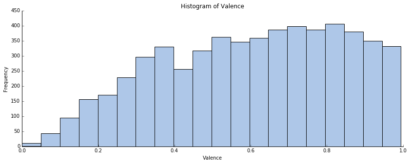
The distribution does not seem to be normal. We observe a plateau for 0.6 <= valence <= 0.9. The population presents less variance than a normal distribution. To illustrate those words, I have used a probability plot:
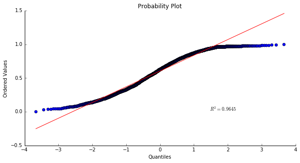
This S shaped-curve indicates shorter than normal tails, i.e. less variance than expected. This confirms that the valence of the tracks is not normally distributed and seems to mainly take values greater than 0.5.
To formalize these observations, I have use the Pandas ‘describe’ command. As I have access to the full population, there is no need to do a hypothesis testing to test if the dataset mean is equal to 0.5. Here are the obtained results:
| Count | 5608 |
|---|---|
| Mean | 0.603195 |
| Standard Deviation | 0.237206 |
| Minimum | 0.000000 |
| 25% | 0.413064 |
| 50% | 0.624989 |
| 75% | 0.803726 |
| Maximum | 0.994769 |
We have a mean value of approximatively 0.6 for the valence. Plus, as the median is equal to 0.625, there are as many tracks having a valence included between 0 and 0.625 and tracks having a valence included between 0.625 and 1. This means that globally the songs of the Billboard Hot 100 sound positive. This confirms my first hypothesis.
We have found a global trend but is it the same thing for each decade? Indeed, it is clear that the musical taste of people has evolved over time, and that the global world situation has an impact on the musical message spread by the Billboard tracks.
Valence by decade
This time I have depicted the distribution of the valence for the Billboard songs decade by decade. This will be helpful in order to try to spot differences and changes over time.
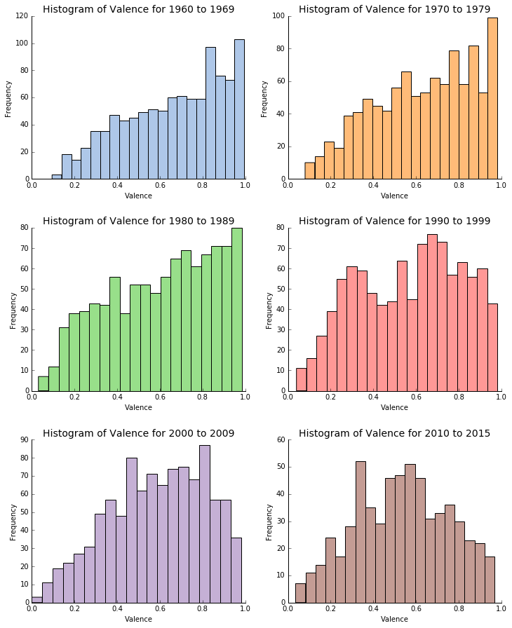
According to the previous series of histograms, it seems that the distribution of the valence is changing over the time, even if the mean and the median of the population do not change a lot. The results are quite interesting.
Between the sixties and the eighties it looks like the high majority of the songs sounds very positive and happy. This is especially true between 1960 and 1979 where both histograms show frequency peaks for valence data close to 1. We do not see the ‘plateau’ phenomenon that appears on the histogram of the full dataset. The sixties were characterized by the influence of the hippie and psychedelic cultures and the advent of rock and roll music. We can for example quote the psychedelic rock and the surf rock as two popular branches of rock and roll in the sixties with artists like Jimi Hendrix, The Doors, The Beach Boys and The Beatles. The seventies saw the rise of disco. Funk, R&B and urban music also became very popular during the 1970s. Stevie Wonder, Lionel Richie and The Jackson 5 were among the biggest music stars of this decade. Based on this short summary, it seems that the musical culture of the 1960s and the 1970s is consistent with the positivity and happiness observed in the songs of this period.
The 1980s and the 1990s are two interesting decades which can be considered as transition periods. Indeed, lots of musical changes happened at this time. The eighties have been marked by the end of the disco era, the emergence of the dance music and new-wave, the premises of the golden-age of hip hop, electro, techno and house music and a still widely listened and diversified rock and roll. In addition, this period is also commonly remembered for an increase in the use of digital recording, associated with the usage of synthesizers, and other electronic non-traditional instruments. It is also interesting to quote that MTV has been created in 1981 entailing a new way of listening to music and also a new music perception through video clips. All these changes have an impact on the distribution of the valence. Even if the majority of tracks still sounds positive and happy, the trend seems to flatten and to look a bit more uniform. This became even more obvious in the nineties where we observe for the first time an important density of tracks with a relatively low variance (< 0.4). Positive and negative sounding tracks are almost balancing each other out. The 1990s saw the continuation of teen pop and dance-pop trends. Hip hop was also very successful in this decade. Using its growing popularity from the 80s, electronic music became a major music genre in the nineties. Nevertheless, it seems difficult to gauge the lasting impact of 1990s music in popular culture. For example, a 2010 European survey conducted by the digital broadcaster Music Choice, interviewing over 11,000 participants, rated the 1990s as the second best tune decade in the last 50 years, while participants of an American land line survey rated the 1990s quite low, with only 8% declaring it as best decade in music. That is also a reason why this decade can also be considered as a transition period.
Finally, the last two decades present a very different valence distribution. There is no more plateau, and the distribution seems to become closer to a normal distribution with a mean located between 0.5 and 0.55. This is particularly the case for the 2010s. The 2000s did not see the creation or emergence of many styles. It has been more a decade where lots of different musical genres coexisted giving birth to some fusions (for example fusion between hip hop and electronic dance). The popularity of rock and roll started to decline in the charts at the end of the decade while hip hop and electronic music were dominating. We also find this idea of multiple musical genres from 2010 to today. Indeed, even if nowadays the electronic and hip hop music are still dominating, we see the come back of traditional instruments, saxophone, rock and roll and teen pop with artists like One Direction or Justin Bieber. For both decades, the rise of the Internet and all its new ways of accessing and listening to music can explain this multiplication and cohabitation of various musical styles from different origins. I guess this can explain the bigger diversity in the valence of the Billboard tracks. Songs do not necessarily have to sound happy and positive to be successful.
The study of the valence is very interesting in order to understand how sound the tracks of the Billboard Hot 100 and how these songs can be perceived by people. It is possible to combine the valence of the song with the energy of that particular song to obtain a strong indicator of acoustic mood, the general emotional qualities that may characterize the track's acoustics. Before combining these two attributes, let's have a quick look at the energy of the tracks.
Energy
To be able to study the acoustic mood of the songs, I have to consider the energy of the tracks. According to the Echo Nest API documentation, the energy of a song can be defined as follows:
Represents a perceptual measure of intensity and powerful activity released throughout the track. Typical energetic tracks feel fast, loud, and noisy. For example, death metal has high energy, while a Bach prelude scores low on the scale. Perceptual features contributing to this attribute include dynamic range, perceived loudness, timbre, onset rate, and general entropy.
The energy ranges from 0.0 to 1.0. To continue with the previous example, death metal will have an energy value close to 1 while a Bach prelude will see its energy being close to 0.
My first intuition about this attribute was that the majority of the tracks ranked in the Billboard charts are dynamic and energetic. In other terms, I was first interested in testing the hypothesis that the the average energy of all the songs in my dataset is greater than 0.5.
I have conducted the same analysis than the one done for the valence. First, I have isolated the energy data for all the tracks and plotted an histogram of the energy distribution.
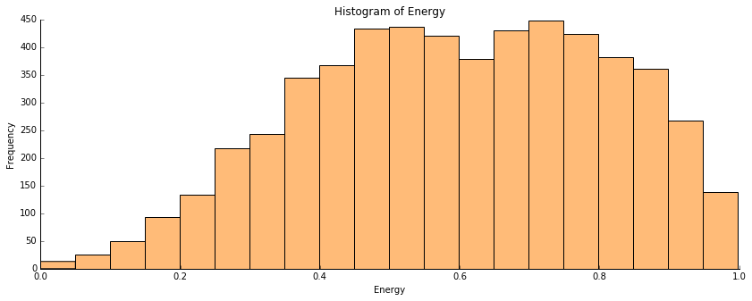
As it was the case for the valence, the energy is not normally distributed. The population presents less variance than a normal distribution. To illustrate those words, I have used a probability plot:
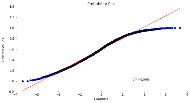
The conclusion regarding the distribution of the energy feature on the global data is similar to the one made for the valence. The distribution is not normal, we have a short tail distribution. This confirms that the energy of the tracks seems to mainly take values greater than 0.5.
To formalize these observations, I have use the Pandas ‘describe’ command. As I have access to the full population, there is no need to do a hypothesis testing to test if the dataset mean is equal to 0.5. Here are the obtained results:
| Count | 5609 |
|---|---|
| Mean | 0.596539 |
| Standard Deviation | 0.212346 |
| Minimum | 0.000020 |
| 25% | 0.438360 |
| 50% | 0.601786 |
| 75% | 0.769029 |
| Maximum | 0.998143 |
We have a mean value of approximatively 0.6 for the energy. Plus, as the median is equal to 0.6, there are as many tracks having an energy included between 0 and 0.6 and tracks having an energy included between 0.6 and 1. This means that globally the songs of the Billboard Hot 100 are dynamic and energetic. This confirms my first hypothesis.
Motivated by the interesting results that I got for the valence, I will now consider the energy of the tracks decade by decade. Indeed, using what we have describe about the different musical genres of each decade it seems reasonable to think that the energy of the songs has evolved over time.
Energy by decade
This time I have depicted the distribution of the energy for the Billboard songs decade by decade. Using the comments made for the valence, we will try to spot differences and changes over time.
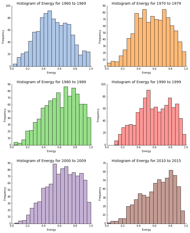
Similarly to what we have noticed for the valence, it seems that the distribution of the energy is changing over the time, even if the mean and the median of the population do not change a lot. The results are quite interesting. It is also possible to spot that the distributions are changing in the opposite direction compare to the valence histograms. That is to say that we observe almost normally distributed data for the 1960s and 1970s and then the distributions become more and more asymmetric. So, even if we have seen that music became more and more diversified, it seems that the most recent popular songs tend to be highly energetic.
According to what has been described for the valence, the energy distribution for the 1960s makes perfect sense. The motto of the hippies was "Peace and Love", this can also be found in the music of this period which sounds relatively quiet.
The average energy of the tracks slightly increases in the seventies. I think that this can probably be explained by the dynamic disco and funk songs and also by the emergence of hard rock with bands like Led Zeppelin and AC/DC.
The energy distributions for the transition decades (the 80s and the 90s) are more difficult to interpret. In the eighties, hard rock and heavy metal (Metallica, Iron Maiden, Slayer) are very popular and obviously very dynamic. R&B and the "young" hip hop are also popular but less dynamic and energetic. Indeed, in the 1980s the creation of rhythm in hip hop was often using the human body via beatboxing techniques. Those techniques are impressive but they cannot generate and release the same energy as the electric guitars of heavy metal. The nineties present an average level of energy. Rock and roll and the new grunge music with bands like Nirvana can explain the high energy component of the nineties. I though that the rise of the electronic music combined with the very popular rock will have given an asymmetric distribution for the 90s, or at least something with higher frequencies for energy > 0.5. The R&B and urban music, also very trendy at this period, are probably compensating. For instance, artists like Mariah Carey do not probably have a lot of highly energetic songs.
Finally, for the 2000s and the 2010s, the energy distribution suggests that these periods are much more dynamic. The tremendous success of electronic music and lively pop music can be used to explained this trend. I think that most popular songs currently produce are dynamic and energetic because they have to be an invitation to dance. Also, the life in the 21st century is in general more dynamic and takes place at a fast pace. This can be perceived in the popular music.
Now that the valence and energy attributes have been described it will be interesting to combine them to have a look at the acoustic mood of the Billboard tracks.
Acoustic Mood
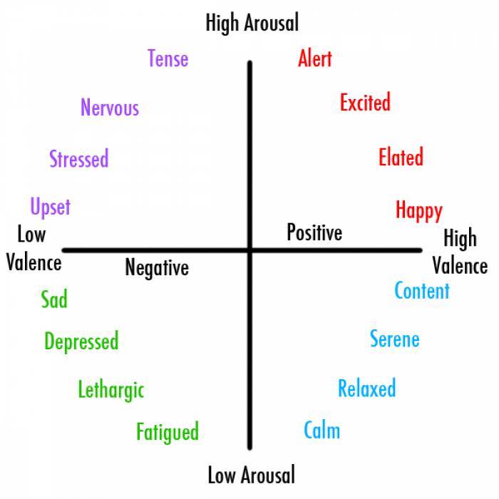
In emotion classification, valence is often combined with energy to yield a four quadrant mood: high energy/high valence, high energy/low valence, low energy/high valence, and low energy/low valence. This model has been developed by James Russell and is called the circumplex model of emotion. These four quadrants are shown below:
To analyze the acoustic mood of the Billboard Hot 100 tracks, I have decided to also use a four quadrant plot. If my previous hypothesis are correct, the majority of the songs should be located on the top right quadrant (valence > 0.5 and energy > 0.5). I have chosen to use an interactive scatter plot with custom functionalities to display this data.
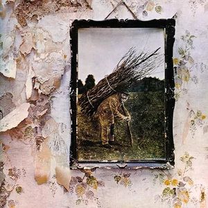
In addition to the Billboard data, I have also chosen to consider the "10 Best Songs of All Time". This is a very subjective ranking, but I think this could be an interesting additional information. Indeed, I said previously that I suppose the majority of the popular tracks on the Billboard Hot 100 sounds happy and dynamic. I am not sure this will be the case for the best songs of all time. For example, I think sad songs can probably make an impact on the long term. I have used the data from the following website: Top Ten Songs of All Time to select the 10 greatest songs of all time. This is a ranking made by people coming on the website and voting for their favorite tracks. I think the results are relevant, plus all the songs are in my study period which is also an advantage. It is also important to mention that these ten tracks are not all in my Billboard dataset. Here is the details of these tracks (on the 22/05/2016):
 |
Bohemian Rhapsody - Queen https://en.wikipedia.org/wiki/Bohemian_Rhapsody |
1 |
 |
Stairway to Heaven - Led Zeppelin https://en.wikipedia.org/wiki/Stairway_to_Heaven |
2 |
 |
Imagine - John Lennon https://en.wikipedia.org/wiki/Imagine_(John_Lennon_song) |
3 |
 |
Smells Like Teen Spirit - Nirvana https://en.wikipedia.org/wiki/Smells_Like_Teen_Spirit |
4 |
 |
Hotel California - Eagles https://en.wikipedia.org/wiki/Hotel_California |
5 |
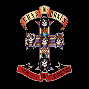 |
Sweet Child O' Mine - Guns N' Roses https://en.wikipedia.org/wiki/Sweet_Child_o%27_Mine |
6 |
 |
One - Metallica https://en.wikipedia.org/wiki/One_(Metallica_song) |
7 |
 |
Comfortably Numb - Pink Floyd https://en.wikipedia.org/wiki/Comfortably_Numb |
8 |
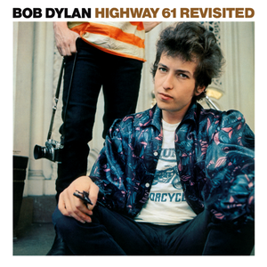 |
Like a Rolling Stone - Bob Dylan https://en.wikipedia.org/wiki/Like_a_Rolling_Stone |
9 |
 |
Lose Yourself - Eminem https://en.wikipedia.org/wiki/Lose_Yourself |
10 |
Below are detailed the different functionalities of the interactive scatter plot:
- By default, the scatter plot shows all the data points of the dataset i.e. the tracks which have a valence and an energy not null. Each decade has its own color. I have chosen the same colors as the ones used for the histograms.
- The vertical and horizontal lines plotted on the graph represent the mean value of the valence (for the vertical line) and the mean value of the energy (for the horizontal line). The idea behind those lines is to see how the data is distributed compared to the theoretical quadrants.
- On the top of the graph, I have selected some representative artists for each decade. They are very famous singers and bands who had a very strong impact on the music of their respective period. By clicking on the artists picture, it is possible to isolate the songs of the selected artist.
- It is possible to filter the tracks by decade to have a clearer view using the buttons on top of the graph (on the second line). Decades can be combined by clicking on several buttons.
- Once an artist has been selected, it is possible to hover over the circles to have the details of the track. If you click on one of these circles, it will play a preview of the track (30 seconds).
- The button "Best Songs of All Time" will let you display on the graph the 10 greatest songs of all time defined previously. It is also possible to play a preview of these tracks by clicking on the associated circles.
60s
The Beatles
70s
Stevie Wonder
80s
Michael Jackson
90s
Mariah Carey
00s
Eminem
10s
Rihanna
The first observation that we can make by looking at the scatter plot is that the majority of the songs are located on the top right quadrant (valence > 0.5 and energy > 0.5). This is a clearer translation of what we have seen on the different histograms. According to the circumplex model of emotions, it seems that the majority of the Billboard tracks sounds happy and / or excited. It is a trend of the popular music of the last 55 years.
By clicking on the different decade buttons, we observe the phenomena that we have described on the histograms i.e. an increase of the average energy and a decrease of the average valence of the songs with time. We observe a slight translation of the musical mood from content / serene in the 60s to nervous / stressed / excited in the current decade. Depending on the perspective we take, it seems that it is either easier to make a popular music today as both high and low valence tracks are performing well or more complicated as it is more difficult to choose and detect what will be successful, there is no secret recipe (we only know that the song has to be quiet dynamic).
Regarding the different representative artists that I have chosen, there are two main categories. The first one corresponds to artists that can really be used as a symbol of how the music of a particular decade sounded. This is the case of The Beatles and Stevie Wonder. Indeed, we have defined earlier the sixties and the seventies as happy, content and serene decades. If we decide to isolate The Beatles and Stevie Wonder we can see that their songs on these periods are perfectly matching that definition. The Beatles, for instance, have around 13 tracks on the top right quadrant of the scatter plot. Excepted some songs like Come Together or Let It Be, their music is very positive but also dynamic and excited. It is interesting to notice that this is one of the oldest bands of the dataset but their music was already using the main factors of popularity that we have identified (positiveness and dynamism). This could be one of the reason why The Beatles are still very popular today. Their music is not old-fashioned. A similar analysis can be made for Stevie Wonder. The majority of his songs are happy and content.
The other artists (Michael Jackson, Mariah Carey, Eminem, Rihanna) are a bit more complicated to analyze. Indeed, they present tracks which are spread across the different quadrants of the graph. We cannot easily describe the mood of their music. They can release serene songs (like Cleaning Out My Closet by Eminem) as well as upset songs (like Lose Yourself by Eminem). Mariah Carey is the perfect example of someone able to perform songs having a very different musical mood. She has quiet a few tracks located on the top and bottom right quadrants of the chart but she also has around 13 songs on the bottom left corner (sad and depressed songs). This means that the same artist can be popular with different kind of music, by conveying different musical emotions and messages. I think this part of the talent of the artist to be able to be successful and affect people with different kind of musical moods. The last interesting thing that we can tell about these artists is that even their songs are globally scattered, in average they are close to their respective decade.
Now, if we spend some time looking at the ten greatest songs of all time we will observe a different trend which matches my previous hypothesis. Indeed, these ten tracks do not follow the same valence / energy pattern as the popular songs of the Billboard Hot 100. They are globally negative songs (valence < 0.5) which pulled over the following emotional categories: stressed, upset, sad, depressed and even nervous or lethargic. I think that this is a very interesting observation. Popular tracks over a year tend to be dynamic and happy, after 2010 it is possible to speak about party songs that people enjoy listening in their car, while doing sports, at work... But when it goes to tracks that really affect people over time and that can remain popular across generations, the results are completely different. Tracks that can generate strong emotions and which are made of a very complex musical structure play their cards right. Even if I like and respect the work of modern musician and especially DJs, I think that amazing songs like Bohemian Rhapsody or Stairway to Heaven require much more work, and are really sophisticated compositions. The music of these songs tells us a story and can carry us away. I think that is why these tracks are ranked among the ten best songs of all time by people on the Internet.
It is also interesting to notice that most of these songs are relatively old songs (all of them are excepted Lose Yourself by Emimem). This makes sense as to be ranked in the greatest songs of all time a song has to go through the years.
Musical Mood Similarities
To conclude this study, I was interested in making a link between the musical mood of the greatest songs of all time defined previously and the songs of the Billboard that are in my dataset. Indeed, we have seen that these top ten songs present some 'unusual' valence / energy characteristics. Therefore, it can be of interest to have a look at the Billboard tracks which are the more similar to the ten best songs of all time (regarding the musical mood i.e. valence and energy). In order to do that, I have chosen to use a simple Nearest Neighbor Search also know as Proximity Search. This algorithm is defined like this on the scikit-learn documentation:
The principle behind nearest neighbor methods is to find a predefined number of training samples closest in distance to the new point, and predict the label from these. The number of samples can be a user-defined constant (k-nearest neighbor learning), or vary based on the local density of points (radius-based neighbor learning). The distance can, in general, be any metric measure: standard Euclidean distance is the most common choice. Neighbors-based methods are known as non-generalizing machine learning methods, since they simply “remember” all of its training data.
I have used scikit-learn to perform the computation. As my number of features was equal to two, I have chosen the Euclidian distance as the metric to calculate the distance between the different tracks. I have also made the arbitrary choice of selecting five nearest neighbors.
To visualize the results I have chosen to use a 'Hierarchical Edge Bundling' (according to name chosen by Mike Bostock). This is basically an interactive graph where all the tracks are displayed on a radial layout and where the relations between the songs are depicted by links. I have grouped the similar tracks by decade, using the same color coding and font as the one use on the musical mood scatter plot. Doing that, it will be easy to see if the similar songs are or are not in the same decade as the considered top ten track.
Here are the detail of the different custom functionalities of the graph:
- The gray cluster on the top right corner of the chart corresponds to the greatest songs of all time. These songs are the starting point of all the links. Each of these songs is linked to several similar songs from the colored clusters.
- The different colored clusters correspond to the similar songs sorted by decade. Each of those tracks is linked to one of the top ten songs of all time.
- If you hover over one track name, this will highlight the link(s) between this track and its similar song(s). This let you identify the different relations between the tracks.
- It is possible to play a 30 seconds preview of the track by clicking on the track label on the graph.
The first general observation is that similar songs can be found in all the different decades. The most represented decades are the 1990s and the 2010s. Is it the sign that current musicians are finding their inspiration on great songs from the past? It may be true, but this cannot be assumed only by looking at this musical mood familiarity search. It is also interesting to note that Eminem track Lose Yourself only has contemporary neighbors.
I find difficult to try to compare the mood of the different neighbors by listening to the tracks in general. The objective of this chart and study of the similarities is more to raise questions and steer people to listen to music and tracks differently. Indeed, some relations are quiet surprising and unexpected. For example, if we consider Smells Like Teen Spirit by Nirvana we can see that the neighbors of this track are two hip-hop songs from the 90s and even more surprising Rolling in the Deep by Adele and Baby by Justin Bieber!
I have spent some times looking at those relations and listening to the different tracks. I have found some interesting couples where I think it is possible to perceive the similarity of the musical mood while listening. This is very subjective and I will let you have your own opinion about it:
- Stairway to Heaven, Led Zeppelin with Can You Feel the Love Tonight, Elton John
- Imagine, John Lennon with Ballerina Girl, Lionel Richie
- Sweet Child O'Mine, Guns N' Roses with No Son of Mine, Genesis
- Comfortably Numb, Pink Floyd with How Can You Mend a Broken Heart, Bee Gees
Conclusion
In this project, I have tried to look at the characteristics of the popular music of the last 55 years using the data from the Billboard Hot 100 year end. I have analyzed different aspect of these tracks and artists and found some interesting information. Most of all, I have spent a great time discovering new artists, new songs and nice relations between them. I also want to insist on the tremendous possibilities that music offers for data science and data analysis. I already have found additional studies that I want to lead on my data. For example, I think this will be fascinating to use natural language processing to do a sentiment analysis on the lyrics of the songs of my dataset and to compare the results with what I have found for the musical mood. Therefore, it should be possible to see if we can have a dissonance between the lyrical and musical mood.